How Your Dashboard Changes as Your Goal Unfolds
Greg Oehmen - Founder, RunnersRun · Apr 23, 2026
Your RunnersRun dashboard doesn't stay still. On day 1 it looks sparse and hopeful. By mid-goal it's dense with history and quietly confident about where you're headed. The transitions are deliberate — the dashboard adapts at each stage so it's showing you the most useful view of your data for wherever you are.
This post walks through the full lifecycle of a goal, from an empty chart on day zero to the final run across the target. It also covers the view controls that let you zoom into specific training blocks once you have enough history to examine.
A short recap of the three lines
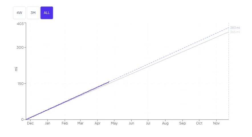
Your Pace Line Graph shows up to three lines over your goal period:
- The Trend Line (solid, slate-colored) — the steady diagonal pace you'd need to maintain to hit your target.
- The Progress Line (solid, indigo) — your actual cumulative miles, climbing as you log runs.
- The Projection Line (dashed, lighter indigo) — a forward-looking estimate of where you're trending to finish, which appears once you've logged at least one run and 7 days have passed.
With that in hand, here's how the whole thing evolves.
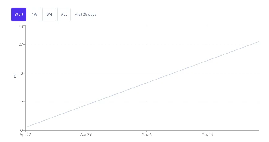
Day 0 — goal created, no runs yet
You've just set your target. The chart shows the Trend Line alone, rising diagonally from zero to your target. There's no Progress Line yet (you haven't run) and no Projection Line (you haven't run AND it's day 0).
Your stats show 0 miles, "on pace," and the full day count of your goal in the Days Left cell. The coaching statement is quiet — there's nothing to coach yet.
The dashboard is waiting.
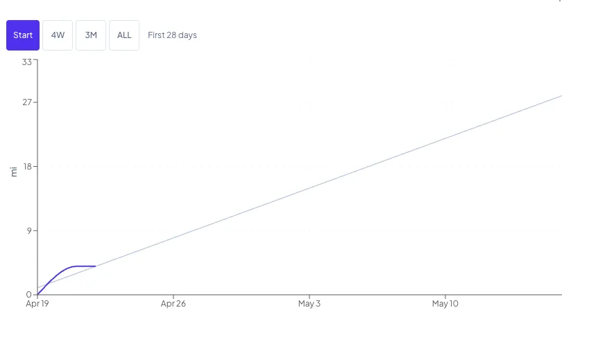
Days 1–6 — the Progress Line appears
The moment you log your first run, the Progress Line appears. It starts at your goal start date at zero and jumps to your run distance on the date you logged. If you log another run three days later, you'll see a flat segment between the two runs, then another jump.
The pattern continues: each run is a step up, each non-running day is a flat stretch forward. That's the product's way of saying "no new miles logged between these dates" — and it's why hovering on any day shows you both your Required Pace and your Current Pace, regardless of whether you ran that day.
Still no Projection Line. Seven days haven't elapsed yet.
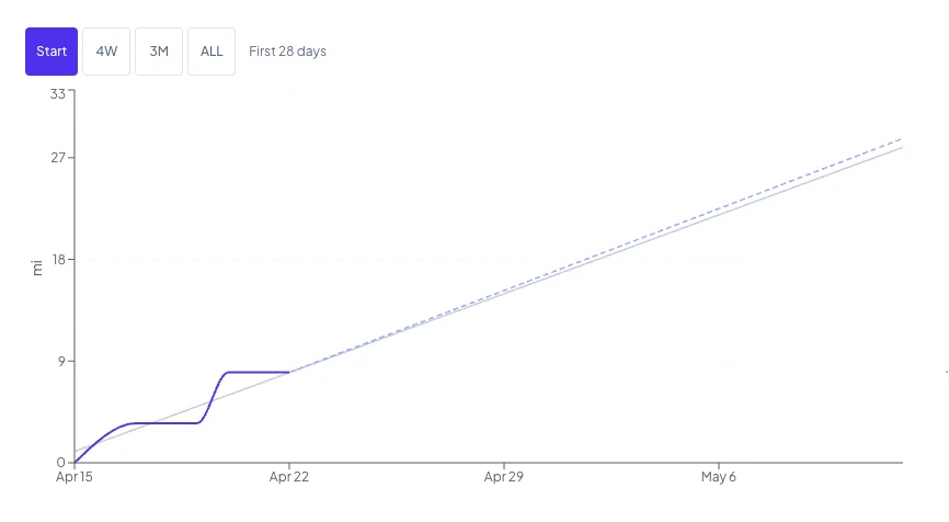
Day 7 — the Projection Line appears
This is the first meaningful transition. At day 7 (or later, if your first run came after day 7), the dashed Projection Line appears, extending from your current progress to your goal end date.
It will be heavily blended toward your target pace at this stage — meaning it will sit relatively close to the Trend Line even if you've been running at a very different rate. That's deliberate; one week isn't enough data to build a confident forecast on, so the projection expresses that uncertainty by leaning on the target you set.
Day 7 is also when the coaching statement starts offering a gap-closure suggestion — but only if you're significantly behind. The remedy appears only when all three of these are true:
- You're more than 5% of your target below pace.
- You're more than 3 miles behind in absolute terms.
- You're past day 7.
Below those thresholds, the coaching line simply states your position. Early noise doesn't trigger advice. The product isn't going to tell you to pick up the pace on day 4 because you're 2 miles behind.
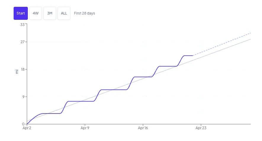
Weeks 2 through 4 — the Projection learns your actual pace
Every day that passes, the projection relies slightly more on your observed rate and slightly less on the target. If you've been consistently running above pace, the Projection Line drifts upward; consistently below, it drifts down. There's no sudden moment where this flips — it's a gradual reweighting.
The dashboard defaults to the Start view during this period, so the chart is automatically zoomed in to show your first 28 days clearly. You won't be looking at a Progress Line stub squashed into the corner of a year-long timeline. (More on views in a minute.)
About 25% of the way through your goal — the Start view retires
Once you pass 25% of your goal duration, the Start view button disappears from the range selector. At this point, you've got enough history that anchoring the chart to the beginning is no longer the most useful default. The dashboard switches its default to the ALL view — the full goal period — because that's now the most informative frame.
By this stage, your Projection Line is mostly shaped by your actual behavior. If the projection is ending below your target, the number it shows is a realistic estimate of where you'll land at your current rate. The coaching statement is fully active.
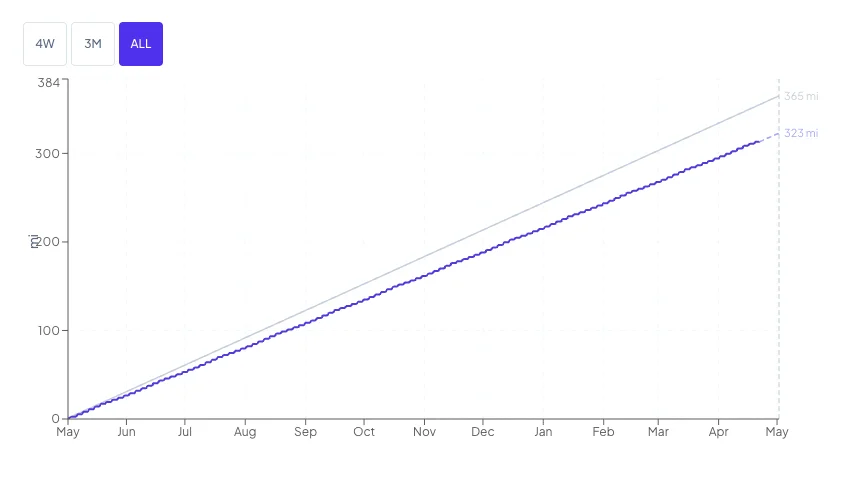
Mid-goal — the chart tells a story at a glance
By the middle of your goal, the Pace Line Graph is dense with history. The Progress Line has real shape: climbs where you strung good weeks together, flat stretches where you didn't. The Projection Line reflects your real running behavior. You can see the full shape of the goal — where you've been and where you're headed — on one chart.
The 4W and 3M views become useful here. When the full goal period makes your recent weeks hard to examine, switching to a 4-week or 3-month window gives you a focused view of your current training block without losing the full-goal framing.
Late goal — the coaching remedy window shrinks
As the days remaining drop, the gap-closure math changes. The default remedy window is 30 days, but the suggestion is always clamped to actual days remaining in your goal. If you're 10 days from goal end and you have a gap, the remedy will compute over those 10 days — it won't suggest a timeline longer than your goal allows.
The projection is almost entirely your observed rate at this point. If it says you'll finish at 340 miles on a 365-mile goal, that's not a discouraging guess — it's a realistic estimate. And the remedy math in your coaching statement is still telling you exactly what to do if you want to land somewhere different.
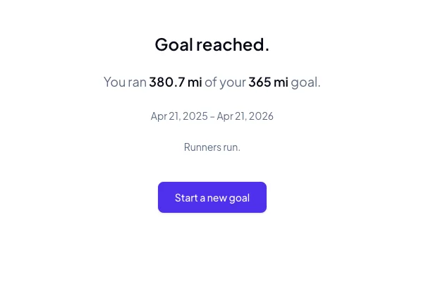
Goal complete — "RunnersRun."
When your goal end date passes, the dashboard switches to a completion summary: final miles logged, whether you hit the target, the goal dates. The coaching line acknowledges it:
"Goal reached. You ran 365 miles. RunnersRun."
The Projection Line disappears at this point — there's nothing to project. A prompt appears to start your next goal whenever you're ready.
If you exceed your goal before the end date, nothing breaks. The Progress Line keeps climbing above the Trend Line. There's no dead-end state. Keep logging runs if you want to.
The four views: Start, 4W, 3M, ALL
Above the Pace Line Graph there's a small set of view buttons. They work like the time-horizon selectors on a stock chart. Which buttons appear depends on your goal length and how far into it you are:
- Goals of 45 days or fewer: 4W, 3M, ALL (no Start — short goals are already readable at full scale)
- Longer goals in their first quarter: Start, 4W, 3M, ALL — defaults to Start
- Longer goals past 25% elapsed: 4W, 3M, ALL — defaults to ALL
What each view shows:
- Start — The first 28 days of your goal, with weekly x-axis ticks. This is the view that keeps your first two weeks of data from disappearing into the corner of a year-long chart.
- 4W — The last 28 days ending today. Focused on your current training block.
- 3M — The last 90 days ending today. Useful for seeing seasonal patterns once you have them.
- ALL — The full goal period. The default view once you've crossed the 25% mark.
The view you pick stays put for your browser session — reload the page and you'll still be on the view you chose.
The y-axis of the chart rescales automatically for each view so the data always fills the frame. On the Start view, the y-axis doesn't climb to your full target — it scales to roughly the proportion of the target you should have logged by the end of that window. The lines stay readable instead of hugging the bottom of the chart.
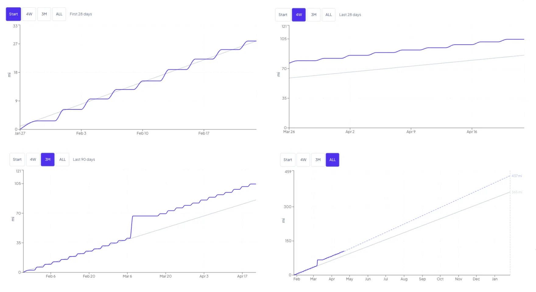
In this example, the 3M view reveals a marathon on day 40 followed by a full week of rest — a sharp spike up and then a flat segment while the runner recovered. Switch to 4W and that story disappears entirely; you're only seeing the steady training block that came after. That's the point of having multiple views: different windows surface different patterns.
A note on tone
Nothing on the dashboard will ever tell you that you failed, fell short, or broke a streak. There are no streaks. There are no badges. A deficit is a gap to close — never a failure.
When you're behind pace and the gap is real, the coaching line will tell you exactly how many additional miles per run, spread over the next 30 days (or 60, if the math gets aggressive), would bring you back in line. That's the product doing its job: answering the question you came here to ask, with a number you can act on this week.
The rest is up to you. RunnersRun - It's what we do.