The Two Lines: Reading the Pace Line Graph
Greg Oehmen - Founder, RunnersRun · Apr 21, 2026
Your RunnersRun dashboard exists to answer one question clearly: Am I going to hit my goal?
Everything on the screen — the graph, the stats, the coaching line — is built around that question. But the core of the answer lives in a single chart with two lines on it. Once you know what those lines mean, the rest of the dashboard falls into place.
This post covers the two lines that appear the moment you create a goal, how they're calculated, and what their relationship is telling you.
The core idea: two lines, one question
The main visual on your dashboard is the Pace Line Graph. Two lines live on it from day one:
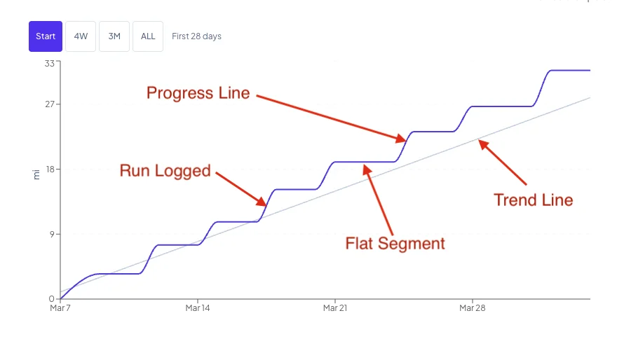
- The Trend Line — sometimes labeled "Required Pace" — is the steady pace you'd need to maintain to hit your target.
- The Progress Line — labeled "Current Pace" — is your actual cumulative miles over time.
The relationship between those two lines is the whole product. When your Progress Line is above the Trend Line, you're ahead of pace. When it's below, there's a gap to close. You don't need to read any numbers to understand your position — the lines tell the story geometrically.
The Trend Line: the pace you'd need to hold forever
The Trend Line is a straight diagonal from the start of your goal to the end of it. It represents evenly distributed effort: the pace you'd need to run every day to land exactly on your target on your end date.
The math is simple: (target miles ÷ total days) × elapsed days. If your goal is 365 miles over 365 days, the Trend Line rises by 1 mile per day. If it's 500 miles over 100 days, it rises by 5 miles per day.
You don't configure it. It appears the moment you create a goal, and if you edit the goal — change the target, change the end date — it adjusts automatically.
A few things to know:
- The Trend Line's value on day 1 is not zero. It's one day's worth of miles. Your Required Pace always reflects what you should have accumulated by the end of that day, not the start of it.
- The Trend Line is a straight line, not a rolling average. It's deliberate. A rolling pace shifts based on recent behavior; the Trend Line is your fixed reference — the original deal you made with yourself.
The Progress Line: your actual cumulative miles
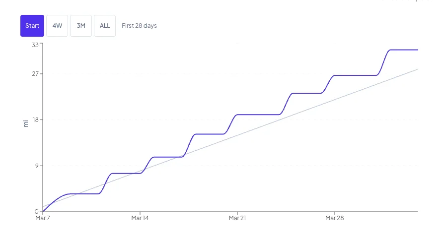
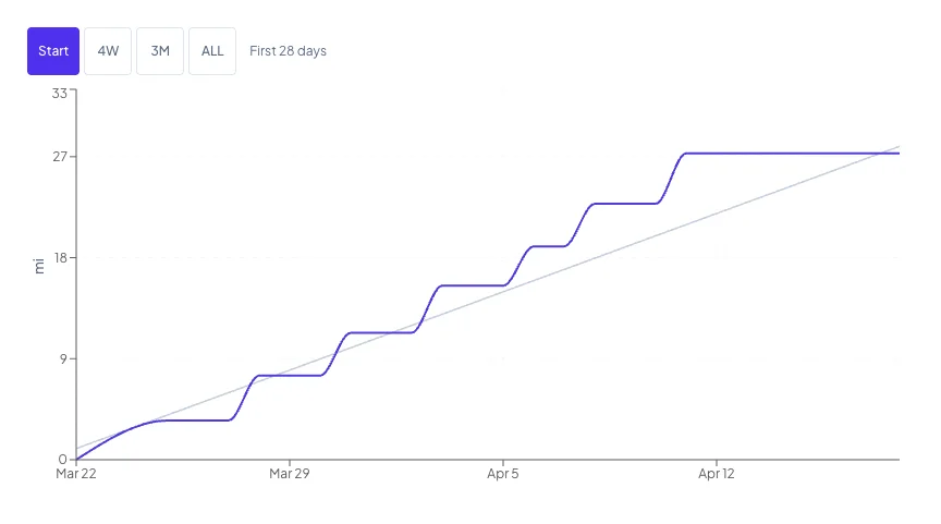
The Progress Line is the one you build yourself. It starts at zero on your goal start date and climbs every time you log a run. Log 5 miles on day 2, and the line jumps from zero to 5. Log 4 miles on day 5, and the line is now at 9.
What's interesting is what happens on the days you don't run.
Flat segments between runs
The Progress Line has a point for every day, including days you didn't run. On those days, the line carries forward the previous cumulative total — creating visible flat segments between your runs.
There's a practical reason for this. Hovering anywhere on the chart gives you a meaningful tooltip, not just on your run dates. If you hover on a random Tuesday you didn't run, you'll still see what your Required Pace and Current Pace were on that date.
The flat segment from your most recent run to today is particularly useful. It's the visual record of the gap you've been letting grow — or, if you're ahead, the cushion you've built while you rest.
Reading the two lines together
Here's what the geometry tells you at a glance:
- Progress Line above Trend Line: You're ahead of the pace you'd need to maintain. Good.
- Progress Line below Trend Line: There's a gap between where you are and where steady pace would put you.
- Progress Line flat while Trend Line climbs: You haven't logged miles in a while; the gap is growing.
- Progress Line jumping up steeply: A long run just landed; you pulled yourself up toward or past the Trend Line.
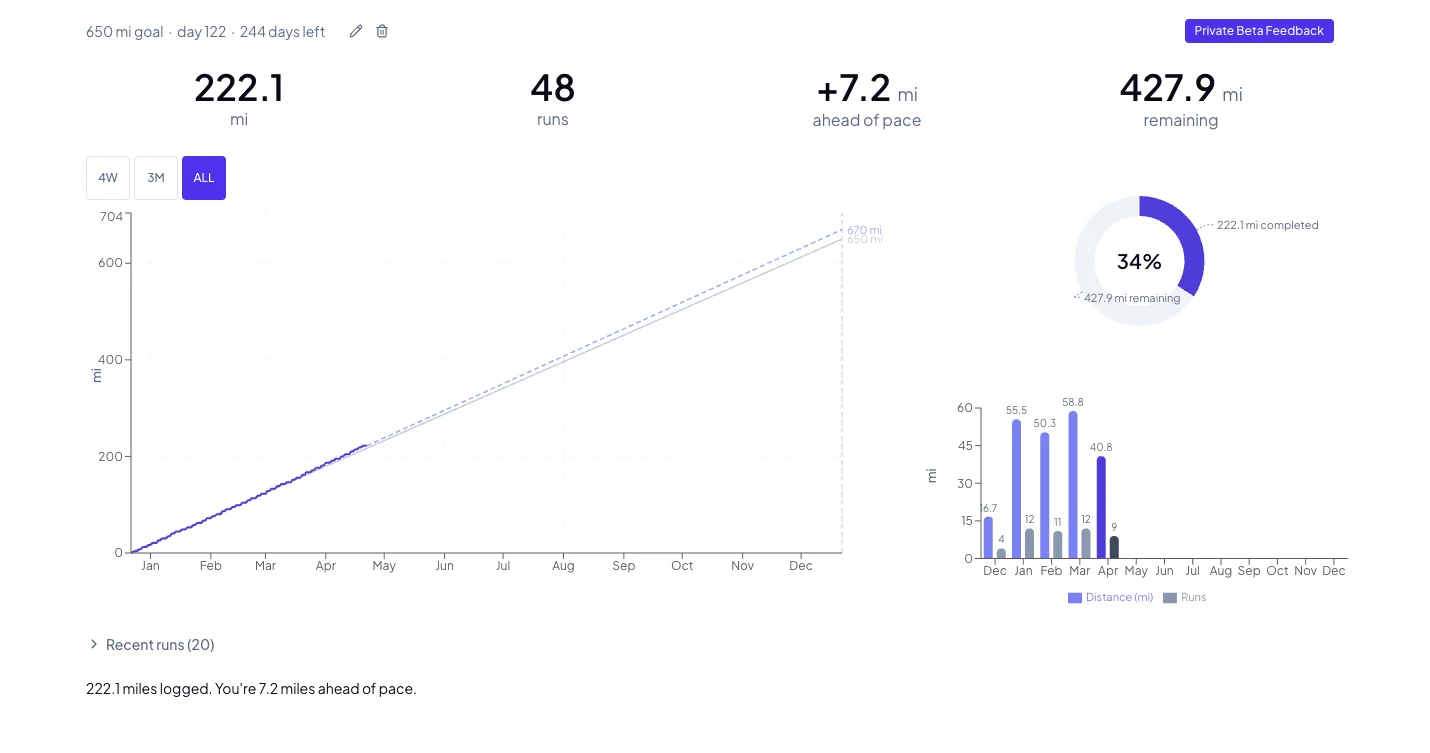
If you want the number version, the stats row below the chart gives you miles ahead or behind pace as a signed value. The graph and the number say the same thing — the graph just says it visually.
The rest of the dashboard, briefly
The Pace Line Graph is the primary visual, but it has companions:
- A Donut Chart shows your overall goal completion as a percentage ring — the simplest single-glance "how far along am I" indicator.
- A Monthly Bar Chart shows miles and run counts per month, with the current month highlighted. This is where you notice your seasonal patterns.
- A stats row gives you the raw numbers: total runs, miles ahead or behind pace, days remaining.
- A coaching statement below the stats summarizes your position in a sentence. Early on and when gaps are small, it just states your position. When gaps become meaningful, it tells you exactly how many additional miles per run would close them.
On mobile, the three charts live in a swipeable carousel. On desktop, the Pace Line Graph gets the large left column and the donut and bar chart stack on the right.
One more line is coming
If you've had a goal going for more than a week, you've probably noticed a third line on the Pace Line Graph — a dashed one, in a lighter shade. That's the Projection Line, and it's the subject of the next post. It waits on purpose. It does math you'd want it to do. And it's the closest thing the product has to an answer for "where am I actually going to finish?"
More on that in The Projection Line: Why It Waits, and How It Learns. For now: the Trend Line is your deal, the Progress Line is your record, and the space between them is the whole story.
RunnersRun - It's what we do.